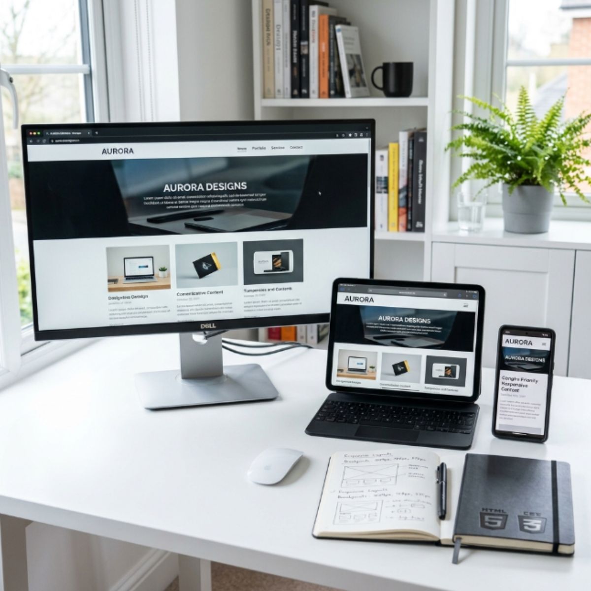
Build websites that look and work properly across desktops, tablets and mobile devices.
★★★★★Rated 5 out of 5
Descriptions
Learn professional responsive design techniques and understand how modern websites adapt to different screen sizes. You’ll practice mobile-first layouts, flexible grids, media queries, responsive typography and device testing. What you’ll learn:
• Mobile-first design
• Media queries
• Flexible layouts
• CSS Grid and Flexbox
• Responsive typography
• Device testing
• Responsive website project